Rebuilding the Engine While the Car Is Moving
How a full re-architecture of Xometry’s quoting experience became a lesson in doing the unglamorous work first.
My Role
- Product Design Lead
Duration
- 1 quarter
Collaborators
- Executive Leadership
- Mechanical Engineers
- Purchasing Teams
- Engineering
- UX Team
- UX Research Team
Tools Used
- Systems design
- Research Synthesis
- Stakeholder Alignment
- Design Direction
- Figma / Figma Make
- Cursor / React
The Problem
A quoting experience held together with duct tape
Xometry’s customers aren’t browsing for fun. They’re mechanical engineers at aerospace firms, procurement leads at defense contractors, and manufacturing operations managers who are responsible for sourcing custom parts, sometimes hundreds of them at a time, on tight deadlines. When they come to Xometry, they upload a CAD file, configure their part specifications, and need a price they can act on. Fast.
The problem was that the two most critical pages in that flow—Part Configuration and the Quote Summary Page—were built on a legacy architecture that made it nearly impossible to improve anything. There was no meaningful web tracking, no A/B testing infrastructure, and no shared design system. Every feature request required months of work, and even then, it was fragile.
On top of the technical debt, the pages themselves had real UX problems. The Part Configuration page forced users to scroll through a waterfall of dropdowns to configure their part, a process that made no distinction between a hobbyist printing a bracket and an engineer specifying a flight-critical CNC component. The pricing display showed four different prices simultaneously, causing confusion at exactly the moment a user needed confidence. And on mobile, the experience was essentially broken.
Before — Quote Summary Page
Before — Part Configuration Page
43.6% of users abandoned Part Configuration before saving their quote. On mobile, that number climbed to 71.8%. The mobile purchase rate was effectively zero.
The Quote Summary Page had its own set of problems. Users had no visibility into shipping costs until checkout, which contributed to a 50% checkout abandonment rate. Mixed quotes—those containing both auto-quoted and manually-quoted parts—converted at 14.6% compared to 39% for fully auto-quoted quotes, because the system forced everything into the slower manual quote workflow, regardless.
Both pages shared the same root cause: years of feature additions on top of a foundation that was never designed to scale. The team knew what needed to be fixed. What wasn’t clear yet was in what order, and how much we could actually ship before reality intervened.
The Approach
Research first, then a very honest conversation about scope
I lead Xometry’s Buyer Experience design team, embedded with a cross-functional group of product managers, engineers, and analysts. My role spanned design direction and critique, early exploration and discovery, and hands-on execution on high-fidelity design, particularly for the more complex interaction patterns.
We started by getting clear on who actually drives the business. Research and usage data pointed to three user types, enterprise engineers, small business owners, and hobbyists, but the revenue picture was unambiguous: enterprise accounts represent the vast majority of Xometry’s business. These are engineers who know exactly what they want, have tight compliance requirements, and are often managing large multi-part quotes on behalf of procurement teams. Designing for their speed and confidence wasn’t just a UX priority; it was a business priority.
Enterprise engineers aren’t exploring. They know custom manufacturing, they know what they need, and they’re evaluating whether Xometry can keep up with them. The job is to get out of their way.
From research and discovery, we identified three core friction categories: cognitive load (too much to process, too little summary), pricing transparency (multiple simultaneous prices causing confusion), and a mobile experience that was essentially non-functional. We also identified a backlog of features the team was excited about, like a parts library, a configuration wizard for new users, deeper FAQ and help integration, and AI-assisted configuration. These were all genuinely valuable ideas.
But we were also staring at a legacy codebase that didn’t support tracking, testing, or rapid iteration. No amount of clever feature work would stick without fixing the foundation. That realization shaped everything that came next.
Midway through the project, our process itself changed significantly. We transitioned from traditional Figma-to-handoff workflows to building directly in Cursor, shipping React components alongside engineering rather than handing off specs. It was a real adjustment. The old process was well-understood and predictable. The new process blurred the line between designer and engineer in ways we were still figuring out. There were stumbles. But it also compressed the feedback loop in ways that made the work better.
The Key Decision
Ship the architecture, not the features
The most important decision on this project wasn’t a design decision. It was a scoping decision, and it was genuinely contentious.
Early in discovery, the design and product teams built out an ambitious vision for Phase 1. We wanted a configuration wizard that walked less experienced users through the process step by step. We wanted a parts library so users could save and reorder pre-configured SKUs without starting from scratch. We wanted AI-assisted configuration recommendations. We wanted better help content integrated directly into the flow. All of it had user research behind it. All of it was the right thing to build… eventually.
But there was a problem: the legacy architecture couldn’t support any of it reliably, and we had no way to test whether any of it actually moved conversion. We were designing features for a foundation that couldn’t measure them
This wasn’t a comfortable position to hold. There was real organizational pressure to show output, and the distinction between “we’re doing the foundational work that makes everything else possible” and “we’re not done yet” is a hard one to communicate, especially when a highly involved senior stakeholder is scrutinizing individual edge cases in weekly reviews.
What helped was keeping the framing anchored in outcomes rather than process. The case wasn’t “we need more time.” It was: “We can’t responsibly test or validate features on the current stack, which means we can’t know what’s actually driving conversion.” The architecture migration is what gives us the ability to learn fast enough to hit our targets. That framing—investment now for compounding returns later—eventually carried the day.
Phase 1 shipped with meaningful but focused UI improvements: a redesigned buy box modeled on familiar e-commerce patterns (a single prominent price, quantity selector, clear CTA), a collapsed accordion configuration form that put a full summary above the fold, a mobile-responsive experience, and improved manual quote messaging. We cut the configuration wizard, the parts library, the AI tooling, and the deeper help integrations. We did that deliberately, and with a clear plan for when they’d come back.
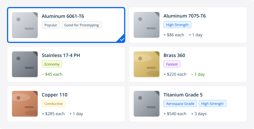
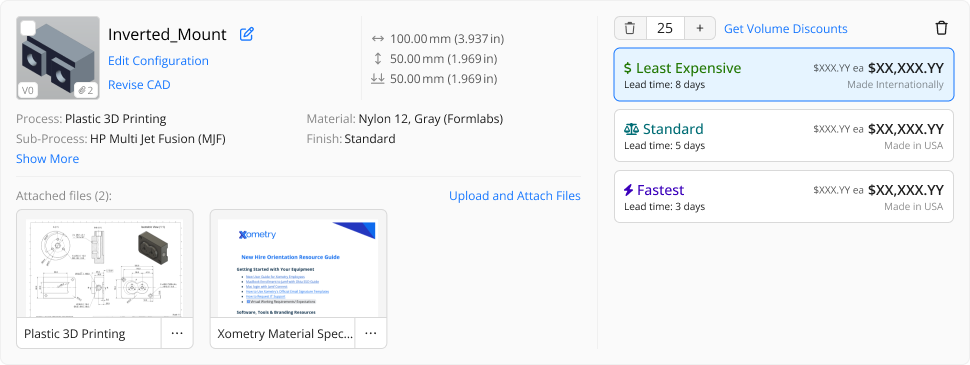
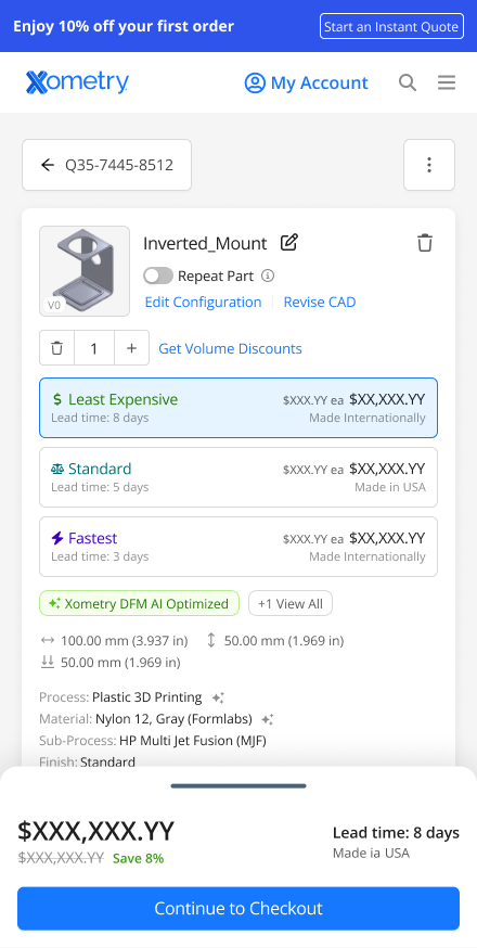
The architecture we shipped in Phase 1 was specifically designed to support what comes next. One example: the selector cards. Phase 1 ships a grid of the most common options with inline search. Phase 2 adds cost and lead time deltas directly on each card, so a user changing from Nylon 12 to Aluminum 6061 sees the price and lead time impact inline, before they commit, the same way a PC configurator shows you the upgrade cost in real time. Material thumbnails and attribute tags like “Good for Prototyping” or “Fatigue Resistant” give less experienced users enough context to make confident decisions without leaving the page.
Phase 2 Direction — Expanded Selector Cards
The Solution
A quoting flow that treats users like they know what they’re doing
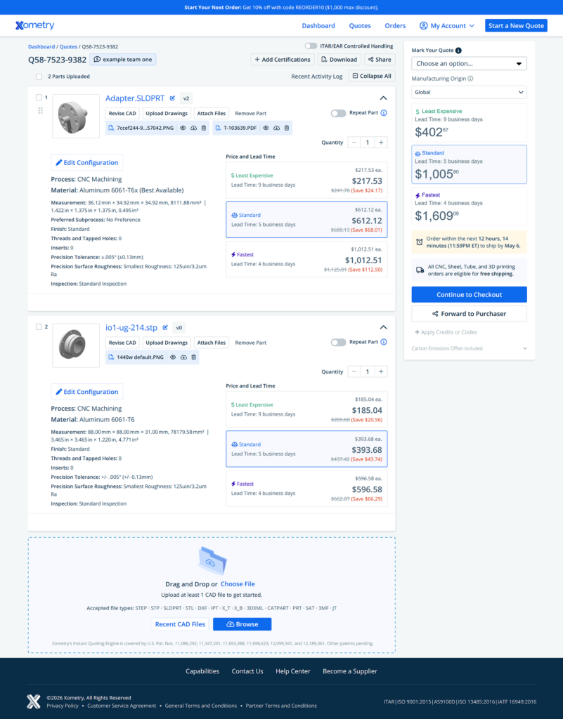
The redesign covers both the Quote Summary Page and Part Configuration. It’s the full arc from “I’ve reviewed my quote” to “I’m locked in on specs and ready to order.” We treated them as a single continuous experience rather than two separate pages, because that’s how users actually move through them.
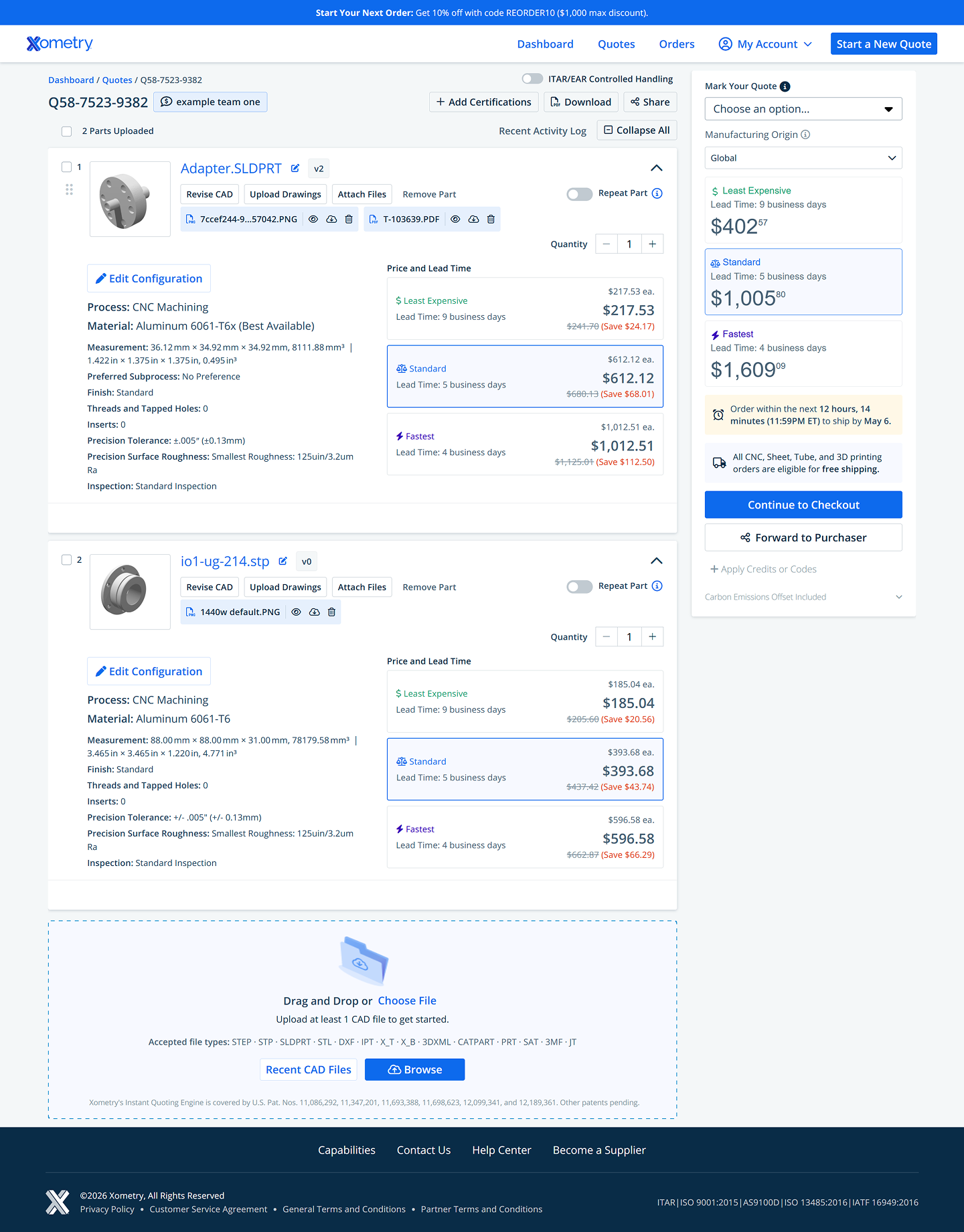
Quote Summary Page
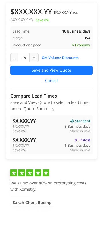
This is where users land first. Phase 1 is deliberately focused: migrate the architecture, fix what’s broken, and make it scannable. The flat table of fully-expanded part cards becomes a collapsed accordion where users see the essential summary for each part without wading through a full spec dump by default. The right rail gets a proper checkout experience: order total, delivery estimate, promo code, payment terms, and carbon offset, all the things that were either buried or broken before. Two bugs that had been quietly costing money get fixed: promo code discounts that weren’t updating the subtotal, and carbon offset pricing that wasn’t showing up in the total. Phase 2 is where the bigger changes land: shipping transparency before checkout, and the ability to order mixed quotes without forcing everything into the manual review queue.
After — Quote Summary Page
The part card redesign.
In the old experience, every card was fully expanded by default: the complete configuration list, attached files, action buttons, and pricing were all visible simultaneously for every part in the quote. On a 20-part quote that’s an overwhelming wall of data before a user has even oriented themselves. The new card defaults to a compact summary: thumbnail, part name, key dimensions, process/material/finish, and a clean “Show More” for users who need the full detail. Pricing tiers move to a consistent right column—Least Expensive, Standard, Fastest—with unit price prominent and lead time immediately visible. Users get what they need to make a decision without the noise.
Before — Part Card
Before — Part Card
Mobile QSP
The previous QSP had no meaningful mobile experience. The expanded card layout simply didn’t work at small viewports. The redesign introduces a properly responsive layout with stacked cards, a persistent order total, and a sticky checkout CTA. Users can review and forward a quote to their purchaser from their phone without needing to be at a desk.
Before — Mobile QSP
AFTER — Sticky Drawer, Collapsed
AFTER — Sticky Drawer, Expanded
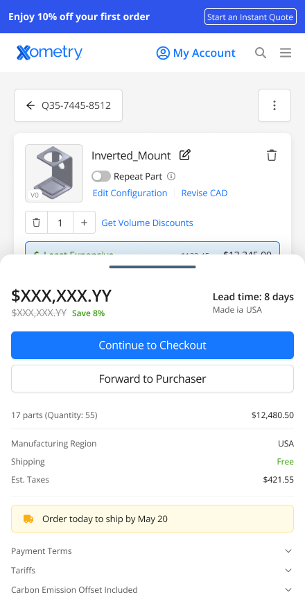
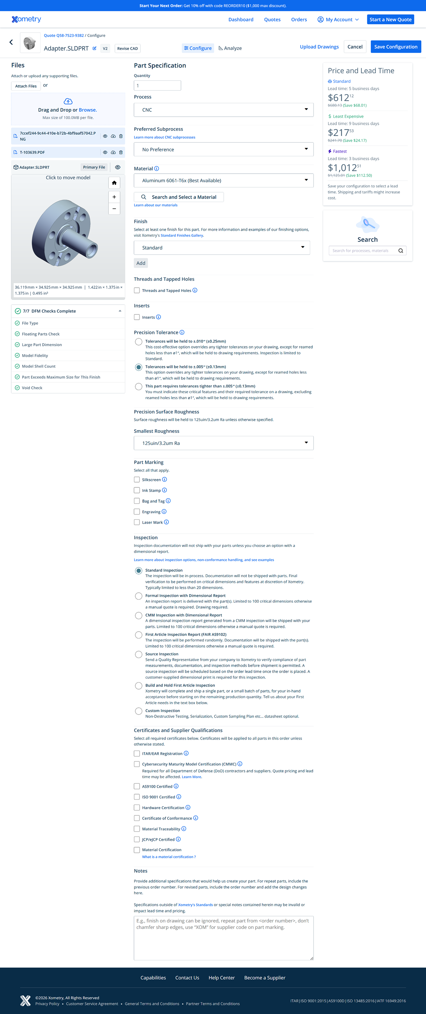
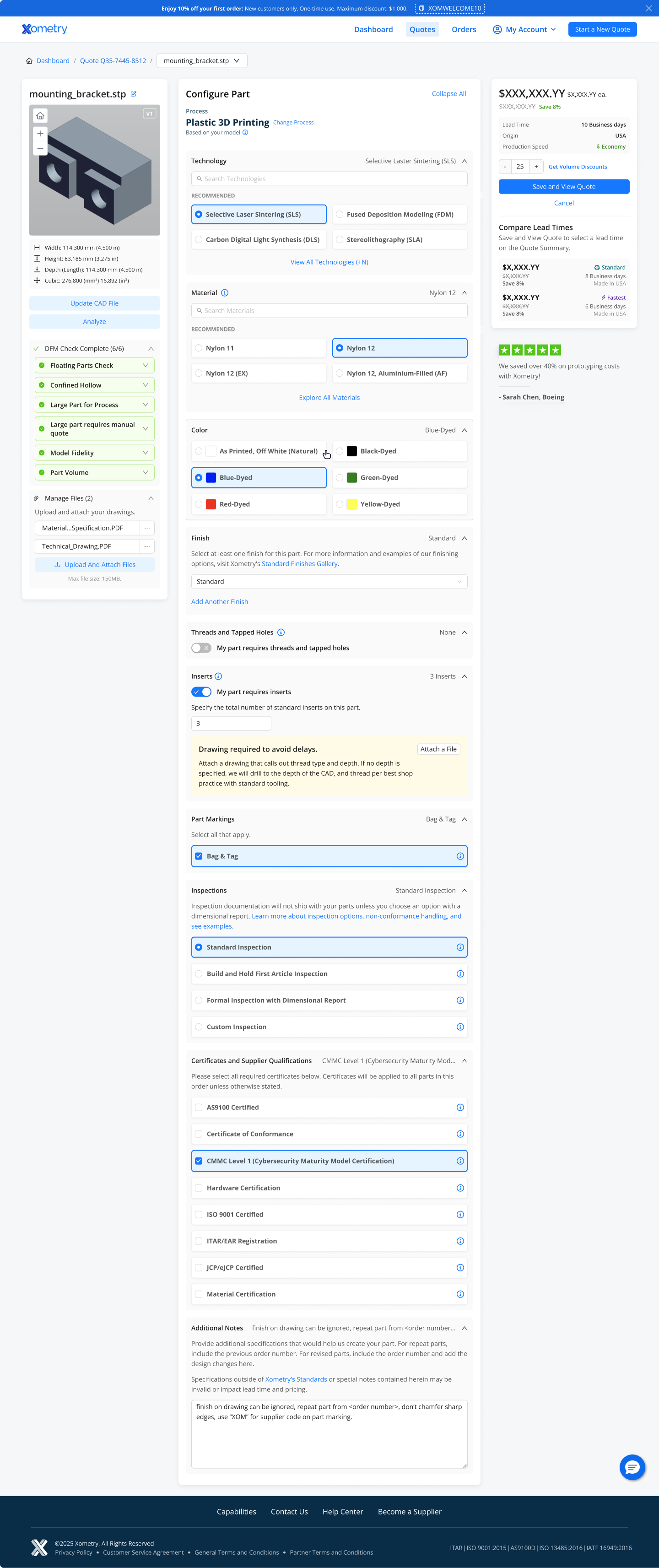
Part Configuration
From QSP, users drill into Part Configuration to adjust specs on a specific part before saving back to their quote. This page had the most ground to cover: a waterfall of open dropdowns, a buy box that showed four prices simultaneously with no clear hierarchy, and a mobile experience that didn’t exist.
The buy box
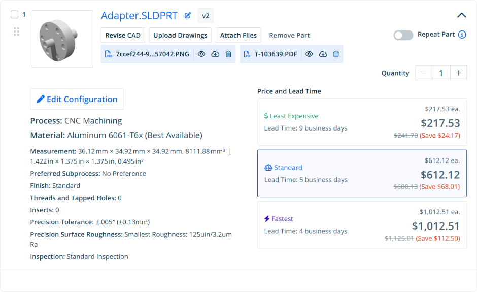
This is the sharpest before/after in the project. The old right rail showed Standard, Least Expensive, and Fastest all at the same visual weight: three large prices competing for attention at exactly the moment a user needs to commit. There was no clear primary. The new buy box leads with a single prominent price for the active tier, with unit pricing and percentage savings front and center. Lead time, origin, and production speed tier sit just below. “Compare Lead Times” moves to a secondary section underneath the CTA. It’s present for users who want to explore, and out of the way for users who’ve already decided.
Before — Part Config Buy Box
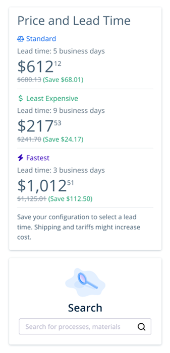
After — Part Config Buy Box
The configuration form
The biggest structural change was moving from a waterfall of open dropdowns to a collapsed accordion that shows your current configuration at a glance. Process, material, and finish are all visible without scrolling. Users who know what they want can scan, confirm, and move on. Users who need to change something expand exactly the section they need. “Expand All” is one tap away.
After — Part Configuration, Collapsed State
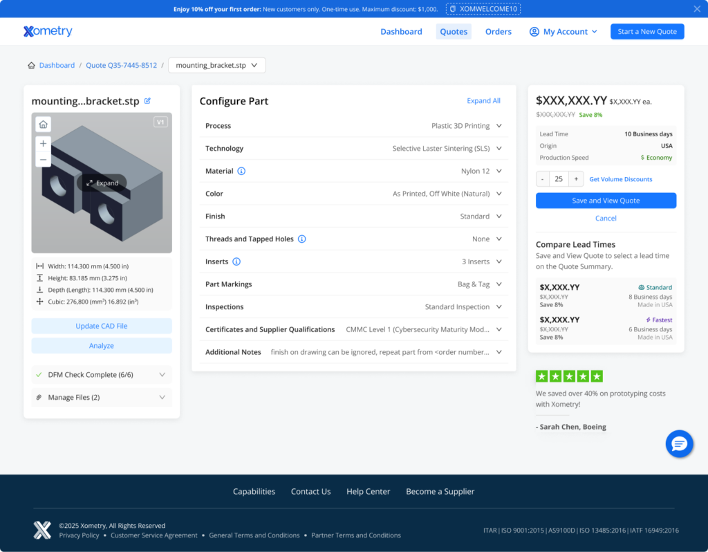
The card UI replaced open dropdowns for material and technology selection with a grid of the most common options—surfaced based on what users actually select—with inline search and a “View All” path for edge cases. This made the form faster for confident users without hiding depth for complex configurations.
After — Part Configuration, Expanded State
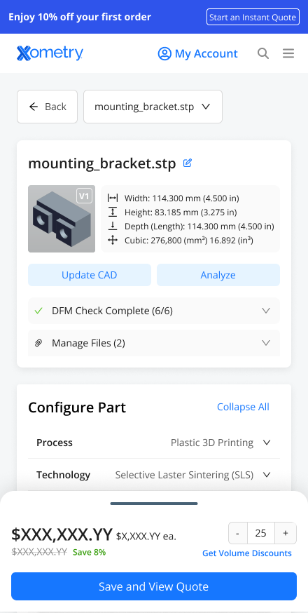
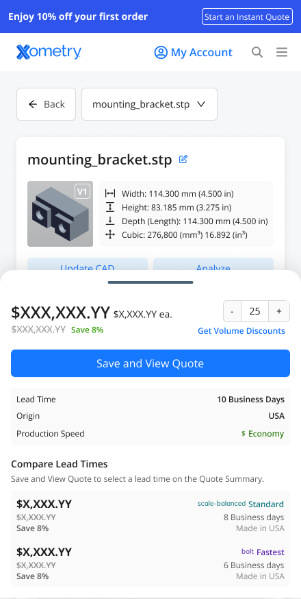
Mobile
The previous mobile experience was not responsive. The desktop layout simply broke at smaller viewports, and mobile purchase rate was effectively zero. The redesign introduces a sticky bottom drawer that shows the current price and a “Save and View Quote” CTA at all times. Users can tap to reveal the full buy box with lead time options. The configuration form collapses intelligently on mobile, and file upload replaces drag-and-drop with a browse button.
Before — Mobile

After — Sticky Drawer, Collapsed
After — Sticky Drawer, Expanded
Underlying all of it: the migration to a new web architecture with GraphQL, Ant Design components, full web tracking, and A/B testing infrastructure. This is the part that doesn’t show up in screenshots but enables everything that comes next.
The Impact
The foundation is in place. The results are coming.
The project is in active development with launch imminent. The targets below are based on historical conversion data. It’s the same data that made the case for doing this work in the first place.
+5%
Quote-to-order conversion lift
Moving from 21% to 22% quote-to-order conversion. It’s a small number with a large impact. At Xometry’s volume, a single percentage point is worth millions.
+$12M
Incremental annual bookings
The projected revenue impact of the conversion improvement, driven primarily by reducing abandonment at the Part Configuration and checkout stages.
4×
Feature velocity on the new architecture
The new stack enables the team to ship and test market-facing features at 4 per quarter. That’s up from a pace that measured new features in quarters, not months.
~0%
Mobile purchase rate — before. Measurably better — after.
The previous mobile experience had a 71.8% abandonment rate on Part Config and a 0% purchase rate. The redesign is the first time mobile has been a real part of the quoting experience at all.
Full A/B test results will be available post-launch. Phase 2 features, including shipping transparency, mixed quote partial checkout, and per-part lead time selection, are scoped and in the queue, enabled by the architecture work completed in Phase 1. AI-assisted configuration, the configuration wizard, and the parts library are on the Phase 3 roadmap.